PURPOSE BUILT COMMUNITIES
Branding
Supported the development of a refreshed brand direction for Purpose Built Communities, a national leader in neighborhood transformation.
This included designing a new logo, typography system,
and color palette to better reflect the organization’s mission of partnering with local organizations to create pathways to prosperity and opportunity in communities across the country.
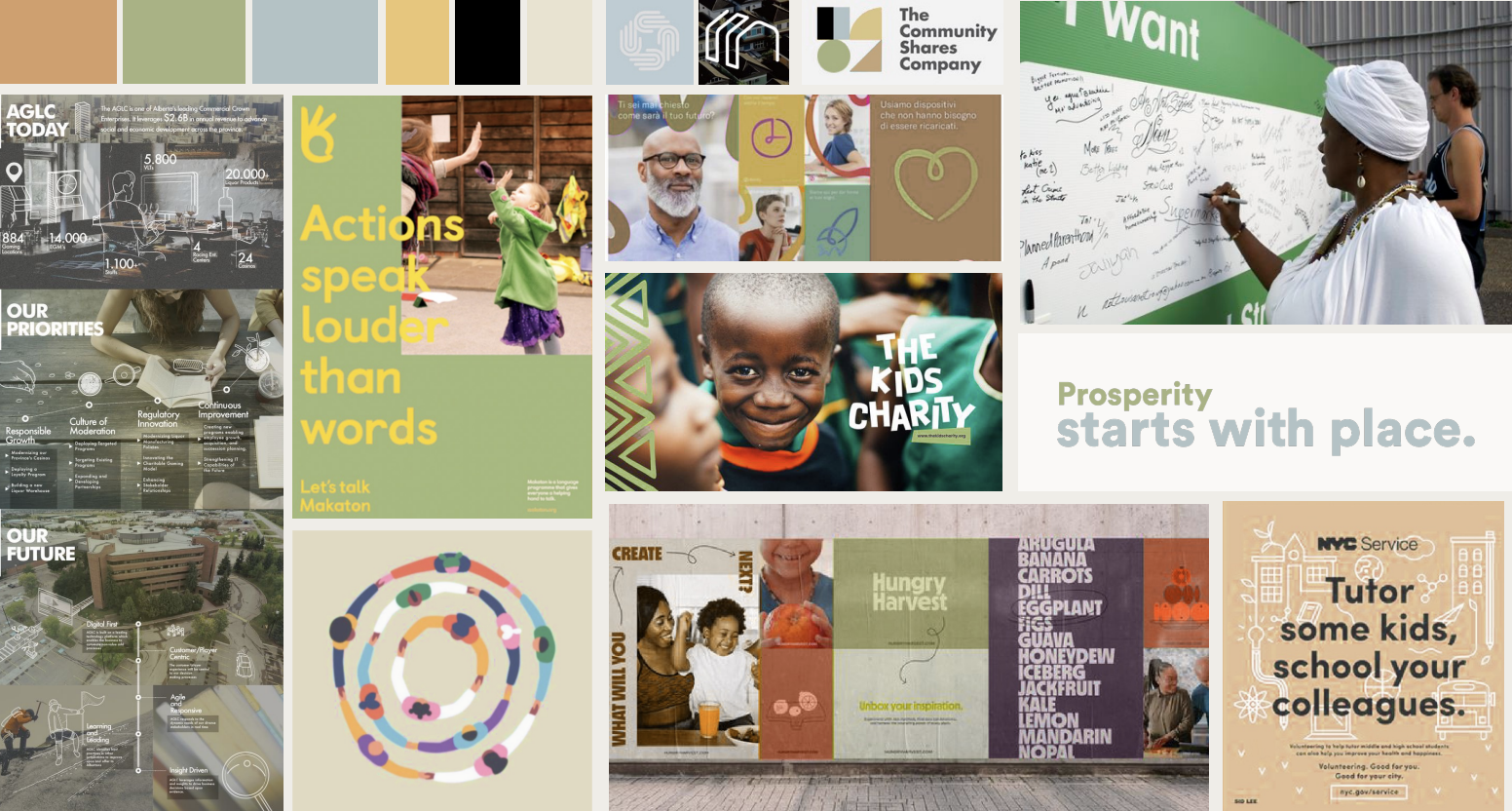
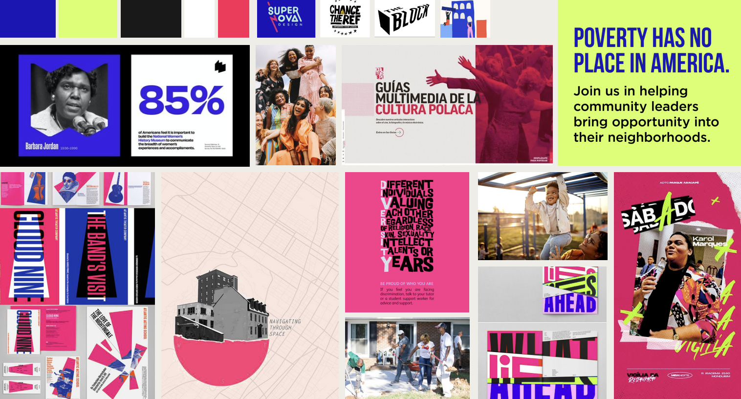
Moodboards
Option 1
Leaning into the role of thought
leader for place-based revitalization

Option 2
Embodying your ethos as a community
conveyer and connector
Option 3
Amplifying advocacy to influence policy and
move the needle for community organizations
Logo Exploration
To help the client distinguish itself from competitors, the goal was to create a more customized and meaningful logo.
Client wanted "PB" acronym to avoid medical connotations of "PBC"
Designs highlights pathways and networks
Aligns with mission to foster opportunity and prosperity

Round 1
Following team reviews, we moved forward with solutions blending my stacked name proposal with a mark inspired by another designer, reflecting a collaborative, team-driven approach to the brand identity.
Concept 3
Concept 1
Concept 2
Round 2

The client responded positively to the initial concepts and requested further exploration of Concepts 1 and 3, along with the development of additional, distinct directions.
Round 3
Title Case vs. All-Caps and Color options

Option 1

Option 2
Option 3

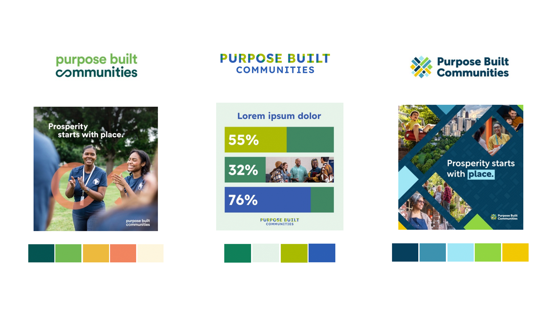
Final Results
Logo
Full Color
Dark Background
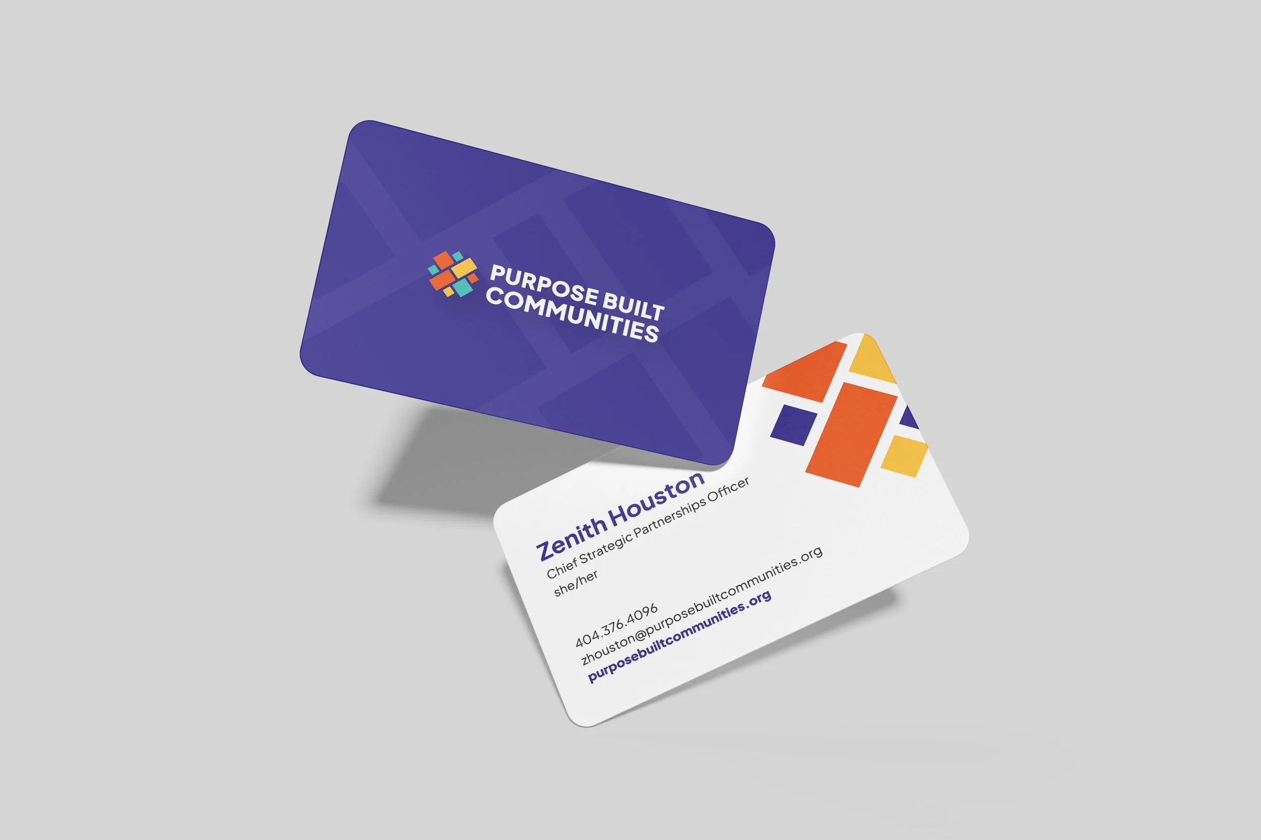
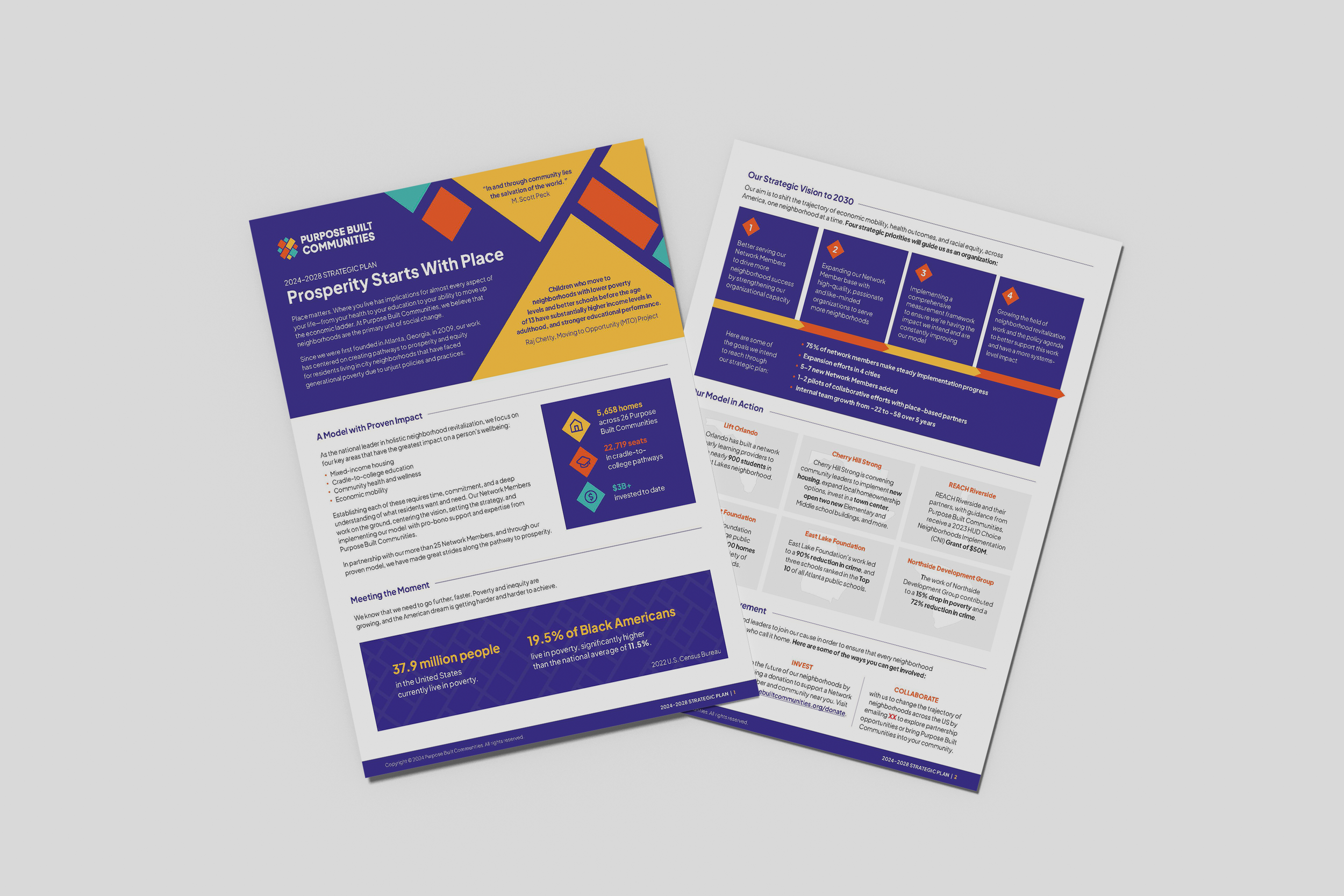
Branded materials